PLEASE NOTE: This tutorial was originally published (some time ago) on the Tuts+ marketplace, which is no longer operating. I haven't had a chance to update the tutorial just yet, but the existing code may still be useful...
Getting started with Android development can be an arduous process. It's difficult to motivate yourself to continue learning a new topic when you feel you're not learning anything particularly useful. In this tutorial we'll aim to equip you with practical, re-usable skills and knowledge by creating an Android battery level widget. As well as getting to grips with the basics of building widgets, we'll cover a range of useful techniques for Android, including:
- handling receivers in widget apps
- creating the manifest for an Android widget
- using resources in Android widgets, including shape drawables, XML values, colors and layouts
- using Java conditionals, including chained if/ else and switch/ case statements
- creating and using helper methods in Java/ Android classes
- using constants and class instance variables
- extending Java/ Android classes using inheritance, including overriding methods
If you haven't created a single Android project yet, this tutorial might
be a bit advanced, but if you've at least had a go at the Hello Android
or another basic app project and have initial familiarity with Java,
this tutorial should be accessible to you. The text runs through each
step in turn and the source code is provided for future reference. The
Java source code files are annotated throughout, and both Java and XML
are explained in detail within the text. Some of the steps are pretty
detailed, but try to focus on each one in turn and not worry about how
fast you are progressing through the tutorial as a whole. We will
intentionally be exploring the techniques in detail, so that you are
more likely to retain the skills into the long term. The tutorial has
lots of images to help you make sure you understand the processes
involved.
What Are We Making?
In this tutorial, we're going to make a battery level widget. Android widgets are released, downloaded and installed in the same way as any other app. However, to launch and use a widget, the user must add it to their homescreen, normally by long-pressing an empty space and choosing "Widgets" before browsing through the list. The widget is going to give a visual and textual indicator of the current battery level. To implement this, we need to define various aspects of the application in XML code, including the visual elements. We will also create a Java class extending a standard Android class to implement the widget's functionality, i.e. updating its appearance to reflect the battery level when it changes.
There are various aspects of the widget that you can alter to suit yourself, and the text will outline some of the areas you have alternative options for. You can choose your own names for classes, variables and resources at any stage, but you may find it easiest to start by following the steps exactly, then make any changes you want later on. This tutorial assumes you are using Eclipse to develop your Android projects, but if you are using another IDE you should still be able to follow the steps. Finally, don't feel under any pressure to complete the steps in one session - work on the project at a pace you feel comfortable with and feel free to go back over any steps you're unclear on.
Step 1: Create a New Android Project
OK, let's get stuck in. Create a new project for your widget in Eclipse or your chosen IDE. In Eclipse, choose File, New, Project. Open the Android folder and select Android Project, then click Next.
Enter your project details. Insert a name for your project, e.g. "LovelyBattery", select "create new project in workspace" and click Next.
Choose your SDK build target, then click Next. You can change this later so don't worry too much about what API level you choose at this stage.
Enter your application info. Your project name should be automatically filled in, but you need to enter the package you want to use for your widget, e.g. "com.yourdomain.battery". Uncheck the Create Activity checkbox, as we don't need this for a widget app. Choose any other settings you want and click Finish. Your new project should appear in the Eclipse Package Explorer.
Step 2: Edit your Project Manifest
You need to instruct the system to treat your app as a widget and set it up for updates. Open your application Manifest file, which you should see inside the package directory.
To access the XML code for your Manifest, click the tab at the bottom of the code editor window containing it, which should be named "AndroidManifest.xml". Creating a Manifest for a widget is slightly different to the process used for normal apps, which are launched through the main user device menu. Use the following code for your Manifest, adding it after the XML declaration on the first line:
If you used a different package, alter the package attribute of the manifest element accordingly. Your IDE will display error messages when you first enter this code, but don't worry, they'll disappear when we add the next elements. You should see two error messages initially because we have not yet added the drawable icon file or the XML metadata file.
It's worth understanding the content of the Manifest to give yourself a clearer grasp of how the Android platform handles widgets. The main difference between this and a normal app Manifest is what's going on inside the application element. Inside this element is a receiver element, which indicates a class name, in this case "LovelyBatteryWidget". This class will handle updating the widget. The receiver element also contains an intent filter and metadata. The intent filter specifies that the widget should be able to receive updates. The meta-data section indicates an XML file which will contain configuration details for the widget.
Don't worry if this seems a lot to take in at first, as we'll revisit some of these elements as we add the code necessary to build the widget. The best way to learn is by using the code yourself.
Step 3: Create the Widget Metadata
As we saw in the Manifest, the widget app uses an XML metadata file. You can see from its entry in the Manifest that the file is going to be named "battery_widget_info" and saved in the XML resources folder, hence the "@xml/battery_widget_info" attribute. You can alter the name of the file when you create it if you like, just make sure it matches the entry in the Manifest.
Create an XML resource folder. Browse to your application package "res" folder and create a new folder inside it by right-clicking on it (Ctrl+click on Mac), choosing New, then Folder. Enter "xml" as the folder name and click Finish. It should appear in your app directory structure. Create your XML metadata file inside this new folder by right-clicking it, choosing New, then File. Enter "battery_widget_info.xml" as the file name and click Finish.
Your file should appear inside the new folder and should automatically open, although it should be empty at first. Again, don't worry if your IDE displays error messages.
Now we need to create the XML metadata. Enter the following inside your new file:
This file indicates the basic configuration details for your widget. The minimum height and width indicate a widget that accommodates a single cell on the user's homescreen, however you can create widgets that occupy multiple cells. In general, you can use around 74 density-independent pixels for each cell in your widget, but we subtract 2 to allow for margins or errors. The "updatePeriodMillis" attribute indicates how often you want your app to update in milliseconds. The value we are using is the shortest period allowed on the Android platform, which is 30 minutes represented in milliseconds. Finally, the "initialLayout" attribute indicates a layout file to use when displaying the widget. Again, your IDE may indicate errors because we have not yet added the specified layout file.
Step 4: Create the Widget Layout
Create a new file in your application layout folder by right-clicking it ("res/layout"), choosing New, then File. Enter the name you used in your metadata file with ".xml" as the extension, "battery_widget.xml" if you used the code above. Click Finish and your file will appear in the layout folder, as well as opening automatically in the Eclipse code editor.
In Eclipse, you can view and interact with layout files using the graphical editor, but this is not normally particularly useful for widgets, so switch to XML by choosing the "battery_widget.xml" tab at the bottom of the code editor pane. Enter XML code for your layout, starting with the following outline:
We will use a Linear Layout to display visual elements one after another vertically. Between the Linear Layout tags we will place the visible elements within the widget. The layout has an ID attribute so that we can reference it from elsewhere in the application code. The layout also has a background image drawable indicated, which we will create later. You can create your own visual design if you like, but for this tutorial we will create a widget with a text indication of the battery level at the top, then a visual area representing the level using ten bars. Add the following code between your opening and closing Linear Layout tags:
This code adds a Text View item at the top of the widget, followed by a horizontal line, represented as a drawable shape which we will create later. The Text View has an ID so that we can refer to it within the application, along with basic properties and some initial text to display. The Image View also sets several basic properties including a margin at the bottom.
Next we need to create ten Image Views, one for each bar within the battery graphic. Add the following code after the last section you added:
Again, each of the ten bars has an ID attribute for reference within the application code. As well as setting basic properties, the bars are initially set to be invisible. Within the Java class handling the widget updates, we will add code to display the bars in a way that reflects the battery level. We will also create drawable resources to represent the bars at low, medium and high level - and to indicate partial levels.
Step 5: Create the Widget Drawables
The battery widget is going to contain several different image resources, which we will save in the "res/drawables" folder. Depending on your own setup, your project may contain three drawable folders, for low, medium and high definition screen displays, named "drawable-hdpi", "drawable-ldpi" and "drawable-mdpi". You can use these to specify different drawable resources for the different resolutions, but you may not need to do this depending on your widget design. For this tutorial, we'll use one drawables folder for all devices, but you can of course change this. If you want to use the three separate folders, simply repeat the process for each item listed, placing a copy of each drawable resource in each of your drawable folders.
First, let's create the application icon. You may remember that we specified a drawable file named "icon" in the widget Manifest, so we now need to create this file. You can create an image file in a format such as JPEG or PNG if you like, but for this tutorial we will create the image in XML, as this is a good general Android skill to develop. If you want to use a graphic file created in another program, simply save it with "icon" as the file name, e.g. "icon.jpg", then copy it to the drawables folder(s) in your application package in the Eclipse workspace. For the XML approach, in your drawables folder(s), create a new XML file by selecting the folder, right-clicking, choosing New, File, entering "icon.xml" and clicking Finish.
Our widget app icon is going to be pretty simple, but you can make it as complex as you like. Add the following code to your icon XML file to begin with:
This code defines an icon image with a green gradient in the middle and a red stroke around it. The image is defined as a Shape Drawable, which is a rectangle. Inside the shape we define the gradient and stroke. The code contains references to color resources, which we will create soon. The final image will appear within the menu presented when the user browses the list of widgets to add to their home screen, as follows:
You can alter the name that appears for your app by editing the "res/values/strings.xml" file, in the entry for "app_name".
Let's create the widget background image drawable. Right-click on the drawables folder, choose New, File, enter "batt_bg.xml" and click Finish. Enter the following code:
In this case we define the image as a rectangle Shape Drawable with a solid but semi-transparent black color filling it (using the Hex representation #ARGB). We also define the rectangle corners so that they appear rounded with the specified radius, as well as defining the image dimensions within the size element. If you look back at the widget layout XML, you will see that this image is specified as the background for the Linear Layout, which represents the entire visible widget.
Next let's add the line image to appear between the text and graphic representation of the battery level. Add another file to your drawables folder(s) by right-clicking, choosing New, File, entering "top_line.xml" and clicking Finish. Notice that we used "top_line" in the XML layout file to indicate the drawable resource within an Image View item. Add the following code to your new drawable file:
As with the background image, we define the line as a solid rectangle shape with a semi-transparent solid color, gray in this case. Again, we use the size element to specify dimensions.
Now we'll create drawable resources for our battery level bars. There are going to be six in total: one each for three colors representing low, mid and high level charge, plus a semi-transparent version of each of these three to represent mid-levels. Create six new files in your drawables folder(s), right-clicking, choosing File, New and entering the following six file names in turn: "level_shape_low.xml", "level_shape_mid.xml", "level_shape_high.xml", "level_shape_low_alpha.xml", "level_shape_mid_alpha.xml" and "level_shape_high_alpha.xml". The code within these six files will be similar - start with "level_shape_low.xml" as follows:
Again, this is a rectangle Shape Drawable, with a gradient of color in which we list color resources we have not yet created. The shape defines its dimensions in the size element and a stroke, which is actually transparent, to create the illusion of empty space around the level bar. The rest of the level shapes are similar, so add the code for each as follows. For "level_shape_mid.xml":
For "level_shape_high.xml":
For "level_shape_low_alpha.xml":
For "level_shape_mid_alpha.xml":
And finally, for "level_shape_high_alpha.xml":
Step 6: Define the Widget Colors
Rather than re-using the same color codes through the design code for an app, you can define them as color resources, then use them from anywhere else in the application code. This means if you decide to change your color scheme, you only have to do it in one place. As you have seen, we have been referring to color resources by name within the drawable files for the widget app, so we now need to create definitions for those colors. In your project "res/values" folder, create a new file by right-clicking the folder, choosing New, File, entering "colors.xml" and clicking Finish.
To edit the file as XML, choose the "colors.xml" tab at the bottom of the editor pane. Enter the following code:
#003300
#99FF66
#990000
#FF9999
#CC3300
#FFFF66
#99003300
#9999FF66
#99FF0000
#99FF9999
#99CC9900
#99FFFF66
As you can see, this defines all of the colors we referred to by name in our level Shape Drawable files. There are 12 colors in total, representing two each for the three level types plus the alpha versions of these. Notice that the only difference between a color and its alpha counterpart is the extra two HEX digits representing the transparency level.
At this point you should see all of the errors your IDE is displaying disappear, as we have provided all of the resources referred to. All of this may seem like preparation for the main event, which is implementing the Java code to update the widget. However, preparing your application resources is often one of the most time-consuming phases of an Android project - we are actually not too far away from being finished.
Step 7: Implement a Java Class to Handle Widget Updates
To create our widget app, we only have one more file to create. However, it does contain a few complex features we will take the time to go over in detail, so that you learn skills you will be able to re-use in future projects.
Create a new Java class in your project. Select your application package in the Package Explorer, which you should see inside the "src" folder. Choose File, New, Class then enter a name for your class, making sure it matches the name you entered in your Manifest file within the receiver element, "LovelyBatteryWidget" if you used the sample code above. Click Finish to see your new Java class file appear inside the package and open in the code editor.
To function as a widget that will update its appearance with the battery level, your class must be structured in a particular way. Firstly, it must extend the class AppWidgetProvider, so alter your class declaration opening line as follows:
public class LovelyBatteryWidget extends AppWidgetProvider
If you are unfamiliar with inheritance or Object Orientation it's worth reading up on the basics at least. In essence, when a class extends another class, it inherits the methods in that class. By extending the App Widget Provider class, our app does not have to provide all of the implementation details for a widget, as the superclass (the parent class we are extending) handles that for us.
Your IDE will display errors because you have not imported the required language resources. Add the following import statement above the class declaration but below the package name:
import android.appwidget.AppWidgetProvider;
Your class file should now look similar to this:
package com.yourdomain.battery;

import android.appwidget.AppWidgetProvider;

public class LovelyBatteryWidget extends AppWidgetProvider {

 //main code here
}
The content of the class will mainly be added between the opening and closing class brackets, with import statements included above. In some cases your IDE may add the import statements automatically. Add the following inside the body of the class (between the brackets):
//constant to store battery steps
private final int BATTERY_STEPS = 10;
//remote views object to access visible interface elements
private RemoteViews widgetViews =
 new RemoteViews("com.yourdomain.battery",
  R.layout.battery_widget);
These are instance variables, which means that they are accessible throughout the class. The first variable is a constant to store the number of battery levels we are using. The second variable gets a reference to the Remote Views for the widget, which will allow us to access the visible user interface elements in order to update them. Notice that the code contains the package name and a reference to the XML layout. You will also need the following import statement, added after the package declaration at the top of the file:
import android.widget.RemoteViews;
Next add the "onUpdate" method:
/*
 * Determine what happens when the widget updates
 * - this method is called repeatedly
 * - frequency determined by updatePeriodMillis
 *   in res/xml widget info file
 */
public void onUpdate(Context context,
 AppWidgetManager appWidgetManager,
 int[] appWidgetIds)
{
  //register for the receiver when the battery changes
 Intent received =
  context.getApplicationContext().registerReceiver
  (null, new IntentFilter(Intent.ACTION_BATTERY_CHANGED));
  //find out what action has been received
 String receivedAction = received.getAction();
  //only carry out amendments if the action is
  //a change in the battery level
 if (receivedAction.equals(Intent.ACTION_BATTERY_CHANGED))
 {
   //get the level amount, pass default value
  int level = received.getIntExtra("level", 0);
   //indicate the level amount within the text view
  this.widgetViews.setTextViewText
   (R.id.text_level, level+"%");
   //call helper to show the level bars
  showBars(level);

   //get component to update
  ComponentName appComponent =
   new ComponentName(context, LovelyBatteryWidget.class);
   //update the widget
  AppWidgetManager.getInstance(context).updateAppWidget
   (appComponent, this.widgetViews);
 }
}
The system will call this method at the interval you indicated in your XML metadata file using milliseconds. The method receives particular items of data, including the application Context, a reference to the App Widget Manager and an array of app widgets, which we don't need in this case. The Context allows us to instruct the widget to respond to receipt of information about changes in the battery level, while the App Widget Manager allows us to call the update. By supplying the "onUpdate" method, you are overriding the method in the parent class (or superclass) you are extending in this class. This just means that you are providing your own implementation of the method rather than using the one in the superclass.
Let's go over what's happening here. First, the method registers to receive the system broadcast indicating the battery level, using the passed context.
Note: The battery level broadcast is what's known as a "sticky" broadcast, meaning that the system allows you to access details of the last broadcast of the battery level that occurred. The code then checks the received data from the broadcast receiver Intent to make sure it is an indicator of the battery level. If it is, the code gets the level, displays it within the layout text-field, then calls a helper method to update the visual indicator we created using our drawables - we will create this helper method next. Finally, the method uses the context and App Widget Manager to update the widget appearance.
Notice the line on which we display the battery level textually. The code uses the Remote Views object instance variable to gain access to the Text View item, by specifying its ID attribute. If you look at the XML layout file for the widget ("res/layout/battery_widget.xml") you will see the ID attribute within the Text View item. This code passes the desired text to display within the Text View, which includes the level as an integer followed by a percent sign.
A note on receivers: in this section we are registering for a receiver from a receiver, since "AppWidgetProvider" is a subclass of "BroadcastRecevier". It is not normally recommended to register for one receiver inside another, as this can have unpredictable results. We get around it here by using the context to register the receiver, passing a null parameter instead of a reference to a Broadcast Receiver object, then accessing the result directly from the returned Intent object, which we are able to do because the broadcast is a "sticky" one as mentioned above. Don't worry if this seems baffling, it's just a little bit of knowledge that you may find useful in future projects.
For this section of code, you need a few more import statements:
import android.appwidget.AppWidgetManager;
import android.content.ComponentName;
import android.content.Context;
import android.content.Intent;
import android.content.IntentFilter;
After the closing bracket for your "onUpdate" method add the "showBars" method to display a visual indicator of the battery level:
/*
 * Helper method to show levels using bar images
 * - takes the last read battery level as parameter
 */
private void showBars(int currLevel)
{
  /*
   * Set the drawable images and visibility
   * depending on the current level
   *
   * Algorithm: For each of the ten levels,
   * if the battery is at that level or above,
   * set the correct graphic and visibility.
   * If not set the image invisible.
   * E.G. for 76% seven bars should be displayed fully,
   * from the bottom up
   */

}
This is just the outline of the method, we will add more code inside it. If you are new to creating your own custom Java methods, notice that the method name matches the method called from the last section of code, and that the parameter type is the same as what we passed to the method, which is an integer. The method receives the integer parameter as an indicator of the battery level to display. We need to determine which level bar images should be displayed, depending on the current level of the battery. Add the following chained conditional tests inside the method:
if(currLevel>=10)
{
 this.widgetViews.setImageViewResource(R.id.bar1,
  R.drawable.level_shape_low);
 this.widgetViews.setViewVisibility(R.id.bar1, View.VISIBLE);
}
else
 this.widgetViews.setViewVisibility(R.id.bar1, View.INVISIBLE);
if(currLevel>=20)
{
 this.widgetViews.setImageViewResource(R.id.bar2,
  R.drawable.level_shape_low);
 this.widgetViews.setViewVisibility(R.id.bar2, View.VISIBLE);
}
else
 this.widgetViews.setViewVisibility(R.id.bar2, View.INVISIBLE);
if(currLevel>=30)
{
 this.widgetViews.setImageViewResource(R.id.bar3,
  R.drawable.level_shape_low);
 this.widgetViews.setViewVisibility(R.id.bar3, View.VISIBLE);
}
else
 this.widgetViews.setViewVisibility(R.id.bar3, View.INVISIBLE);
if(currLevel>=40)
{
 this.widgetViews.setImageViewResource(R.id.bar4,
  R.drawable.level_shape_mid);
 this.widgetViews.setViewVisibility(R.id.bar4, View.VISIBLE);
}
else
 this.widgetViews.setViewVisibility(R.id.bar4, View.INVISIBLE);
if(currLevel>=50)
{
 this.widgetViews.setImageViewResource(R.id.bar5,
  R.drawable.level_shape_mid);
 this.widgetViews.setViewVisibility(R.id.bar5, View.VISIBLE);
}
else
 this.widgetViews.setViewVisibility(R.id.bar5, View.INVISIBLE);
if(currLevel>=60)
{
 this.widgetViews.setImageViewResource(R.id.bar6,
  R.drawable.level_shape_mid);
 this.widgetViews.setViewVisibility(R.id.bar6, View.VISIBLE);
}
else
 this.widgetViews.setViewVisibility(R.id.bar6, View.INVISIBLE);
if(currLevel>=70)
{
 this.widgetViews.setImageViewResource(R.id.bar7,
  R.drawable.level_shape_high);
 this.widgetViews.setViewVisibility(R.id.bar7, View.VISIBLE);
}
else
 this.widgetViews.setViewVisibility(R.id.bar7, View.INVISIBLE);
if(currLevel>=80)
{
 this.widgetViews.setImageViewResource(R.id.bar8,
  R.drawable.level_shape_high);
 this.widgetViews.setViewVisibility(R.id.bar8, View.VISIBLE);
}
else
 this.widgetViews.setViewVisibility(R.id.bar8, View.INVISIBLE);
if(currLevel>=90)
{
 this.widgetViews.setImageViewResource(R.id.bar9,
  R.drawable.level_shape_high);
 this.widgetViews.setViewVisibility(R.id.bar9, View.VISIBLE);
}
else
 this.widgetViews.setViewVisibility(R.id.bar9, View.INVISIBLE);
if(currLevel>=100)
{
 this.widgetViews.setImageViewResource(R.id.bar10,
  R.drawable.level_shape_high);
 this.widgetViews.setViewVisibility(R.id.bar10, View.VISIBLE);
}
else
 this.widgetViews.setViewVisibility(R.id.bar10, View.INVISIBLE);
Try not to be intimidated by the length of this section, if you look through it you'll see it's fairly simple. For each of the ten levels (0-10, 10-20 and so on) the code checks whether the battery is at that level or above. If it is, the code sets the fully solid image for that level and instructs the system that it should be visible. If not, it sets the level View invisible. Each level is referred to using the ID attribute for its corresponding Image View item in the layout XML.
In another context, it would be more efficient to use a loop structure to carry out this process, but here we need to use the auto-generated "R" data to access the View items, so that is not possible, hence the lengthy conditional.
Next we need to deal with partial levels. For example, if the level is 35%, we want to display three full bars and one partial bar, indicating that the level is between 30 and 40. Add the following:
/*
 * We also want to show a partially visible level to
 * represent the battery level more accurately.
 * E.G. for 34% there should be three fully visible
 * bars and one partially visible.  We need to work out
 * which level should be set partially visible
 */
 //deal with the remainder
int partLevel = currLevel%BATTERY_STEPS;
 //find out how many full levels we have
int fullSteps = currLevel-partLevel;
 //find out which is the next level up and
 //call helper method to set partially visible
if(partLevel>0) setPartStep((fullSteps/BATTERY_STEPS)+1);
This code first determines the remainder of the level after dividing by ten, then calculates how many full levels we have. Finally, if the remainder is greater than zero (e.g. the level is 34 or 79 rather than 30 or 70), the code calls a helper method, passing the number of the step we want to partially display. Next we will write the helper method. After the closing bracket for the "showBars" method but before the closing bracket for the class as a whole, add the following method outline:
/*
 * Helper method to set partial level step drawable
 * - takes the partial level to set visible
 */
private void setPartStep(int partLevel)
{
 //method implementation
}
This is the method outline, matching the name we called in the last section of code and taking an integer parameter, which is what we passed from there. Add the following code (between the method brackets):
//precaution - should not really be necessary
if(partLevel>BATTERY_STEPS) return;
else
{
 //the process should only be setting one level
 //I.E. for 45% the fifth bar up from the bottom
 //should be set partially visible
 //- find out which level and set the image drawable,
 //then visibility
 switch(partLevel)
 {
 case 1:
  this.widgetViews.setImageViewResource(R.id.bar1,
   R.drawable.level_shape_low_alpha);
  this.widgetViews.setViewVisibility(R.id.bar1,
   View.VISIBLE);
  break;
 case 2:
  this.widgetViews.setImageViewResource(R.id.bar2,
   R.drawable.level_shape_low_alpha);
  this.widgetViews.setViewVisibility(R.id.bar2,
   View.VISIBLE);
  break;
 case 3:
  this.widgetViews.setImageViewResource(R.id.bar3,
   R.drawable.level_shape_low_alpha);
  this.widgetViews.setViewVisibility(R.id.bar3,
   View.VISIBLE);
  break;
 case 4:
  this.widgetViews.setImageViewResource(R.id.bar4,
   R.drawable.level_shape_mid_alpha);
  this.widgetViews.setViewVisibility(R.id.bar4,
   View.VISIBLE);
  break;
 case 5:
  this.widgetViews.setImageViewResource(R.id.bar5,
   R.drawable.level_shape_mid_alpha);
  this.widgetViews.setViewVisibility(R.id.bar5,
   View.VISIBLE);
  break;
 case 6:
  this.widgetViews.setImageViewResource(R.id.bar6,
   R.drawable.level_shape_mid_alpha);
  this.widgetViews.setViewVisibility(R.id.bar6,
   View.VISIBLE);
  break;
 case 7:
  this.widgetViews.setImageViewResource(R.id.bar7,
   R.drawable.level_shape_high_alpha);
  this.widgetViews.setViewVisibility(R.id.bar7,
   View.VISIBLE);
  break;
 case 8:
  this.widgetViews.setImageViewResource(R.id.bar8,
   R.drawable.level_shape_high_alpha);
  this.widgetViews.setViewVisibility(R.id.bar8,
   View.VISIBLE);
  break;
 case 9:
  this.widgetViews.setImageViewResource(R.id.bar9,
   R.drawable.level_shape_high_alpha);
  this.widgetViews.setViewVisibility(R.id.bar9,
   View.VISIBLE);
  break;
 case 10:
  this.widgetViews.setImageViewResource(R.id.bar10,
   R.drawable.level_shape_high_alpha);
  this.widgetViews.setViewVisibility(R.id.bar10,
   View.VISIBLE);
  break;
 default:
  break;
 }
}
We use a switch/ case statement here because we only need to set one level partially visible. The switch statement tests which level is to be set. When it hits on the correct one, it specifies the partially transparent image for that level, then sets it to be visible, before breaking out of the statement.
We need one more import statement at the top of the class file:
import android.view.View;
And that's it! Test your app by launching an AVD and running your widget app on it. When you run a widget app in the emulator, Eclipse (or your chosen IDE) may display error messages informing you that the app cannot be launched, but don't worry. Once you have installed the widget app on a virtual device, add it as you would on an actual device, by long-pressing the homescreen, selecting "Widget" and browsing through the list until you find yours. Once you have it on the homescreen it will keep appearing each time you launch that virtual device.
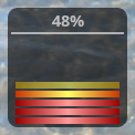
When you run the widget app on an AVD device, it will display at 50% by default. To see it working properly, export the app and install it on an actual Android device. Here is a sample of the widget at three different levels, running on an actual device.
Notes
As mentioned above, you may wish to tailor your widget appearance to different device sizes, depending on your own particular design. If you target SDK version 14, your widgets will automatically be displayed with margins around them, so bear this in mind. If you want to explore this topic to a more advanced level, there are a number of possible areas to consider, such as making the widget occupy more than one cell. Our widget at the moment can only update a maximum of every 30 minutes - if you want to create one that can update more often, you can also look into using the Alarm Manager in conjunction with a Service or Activity class. You can make the widget interactive, by detecting user clicks, for example to allow the user to choose settings such as update frequency. You can also include a configuration Activity class/ Intent in your widget app, to set advanced config details that cannot be set using the XML info file we created for this tutorial.
The
source code files contain everything in this tutorial plus some additional notes. To find out more about the topics in this tutorial or to have a go at some of the more advanced topics, see the following sections of the official Android Developer Guide:


